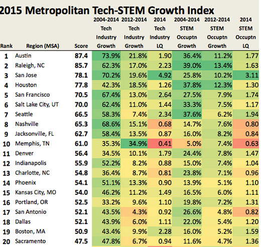
Look who is number seven and number 16! Now this is a list we want to be on. From the Praxis Strategy Group, this chart compiles the data for the metro areas that are generating the most tech jobs. Many of these people buy real estate, folks.
Explanation of rankings: “To determine the metro areas that are generating the most tech jobs, Mark Schill of Praxis Strategy Group, examined employment data in two different categories. Half our ranking is based on changes in employment at companies in high-technology industries, such as software and engineering. (This includes all workers at these companies, some of whom, like janitors or receptionists, do not perform tech functions). Half is based on changes in the number of workers classified as being in STEM occupations, which captures tech workers who are employed in all industries, including those not primarily associated with technology, such as finance or business services. We ranked the 52 largest U.S. metropolitan statistical areas by the growth in tech and STEM employment from 2004 to 2014, as well as for their more near-term growth from 2012 to 2014 to give credit for current momentum.”