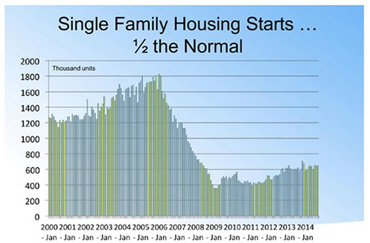
This chart from the National Association of Realtors dramatically illustrates how new housing starts are at only half of what they were 15 years ago or so. The NAR article goes on to list some of the reasons:
Capital gains exclusion on primary residence. It changed on May 7, 1997. As a result, the typical move-up buyer has remained more frozen, thereby reducing available inventory;
Low rate environment. Many current homeowners are locked into low, low, low interest rates for a number of years and do not want to lose that great advantage. So they tend to stay put.
During the Grand Recession, 2007 – 2011, home values were reduced and are just now catching up. This has stopped the normal ebb and flow of moving up.
Sense that values will continue to climb. There is some mentality that values are still going up, so the homeowner/spectulator wants to still wait a bit.
It is difficult to reverse the prolonged decrease in new housing starts. The start-to-finish build cycle is lengthy, requiring multiple years to plan, approve, build and market. Until the new housing development engine gets moving at an accelerated pace it will continue to have a lingering impact.